Designs Trends for 2021 & how to achieve them in Squarespace
PixelHaze Creative Director Ken Rees shares the top design trends leading into 2021 and how these trends can be implemented effectively into your Squarespace site.
Minimal Design
In this decade, we’ve seen a major transition into minimalist design which is now being implemented into websites & branding. The flat design style has taken the world by storm offering clear, fun illustrations with little detail. It is the core of the message that’s being delivered, avoiding unnecessary detail which would distract from the main message. It’s short, snappy and gets the viewer straight to the point.
Brands have ditched their overly complicated original logos which now appear quite dated next to their newer minimal brands. Their older logos used gradients, shadows and larger colour pallets, all styles which don’t need to be there. The new push for minimal flat design takes these over complicated logos and strips them to their core message.
Apple is the perfect example of how to use minimalism in all aspects of your design. Their philosophy is present in all stages of their design process, from the packaging to the product. In their latest advertisement for the Apple AirPods Pro, they have used their bold iconic Apple typeface on top of a black and white image creating a vibrant contrast which offers a professional finish to the page. Instead of showing the whole image of the AirPods, they’ve opted to show as little as possible through the light reflection off of the product.
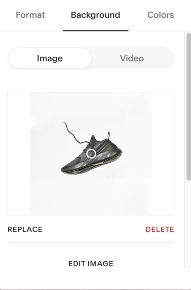
Using Squarespace, I mocked up a site which uses the same design principles. To achieve this minimal effect. It is important to use strong photography to achieve this effect. An image says a thousand words, so without quality photos, it would be difficult to replicate this look. I used Squarespace’s built-in stock library ‘Unsplash’ to gather a high quality, minimal image.
With the right image selected, I edited the banner and uploaded the image to the background. This allowed me to edit on top of the image, placing components like text and buttons on top of the image.
To achieve the large bold font on top of the image I went into
Design > Fonts > Headings.
Here I changed ‘Heading 1’ font to a stylised simplistic Montserrat. I then increased the scale using the sliders below to the maximum size.
The strong image accompanied by simple bold text leaves a professional modern finish to your Squarespace site.
Typography lead
Instead of just images alone, using the right typeface can add to the tone of voice and overall feel of your branding and website. In the example above, a lush Serif typeface has been used alongside playful image type to achieve a unique look.
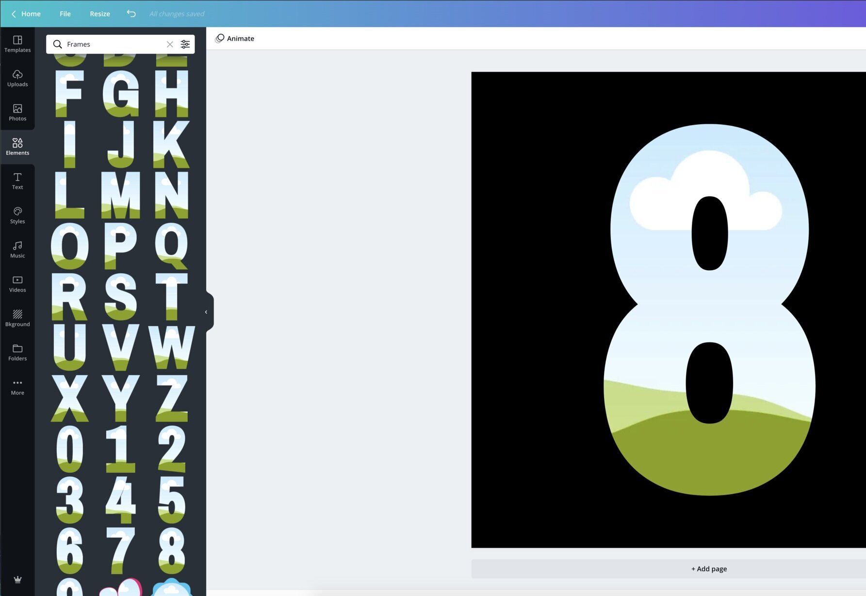
To achieve the effect above, it is more or less the same process we used for the minimal design above but requires some photo editing skills. There are a number of different programs which can be used to achieve this effect, my go-to is Adobe Illustrator, although this can be a costly choice, there are other design software options available which are free and can achieve the same effect. For example Canva.
Canva is a simple, free alternative to your design needs. By creating a new template and using one of the existing frames available, you can drag and drop images into these specific frames, export the artboard as an image and then upload it as a background image to the Squarespace site.
Although useful, Canva has it’s limitations. You are only able to use the templates provided rather than make your own custom shapes.
Canva
Adobe Illustrator
Adobe Illustrator, although not as cheap, is far more intuitive and gives you all the creative freedom you need to create pretty much anything. In the example above I used a typeface which suited my brand, converted the type into an object, and then created a Clipping Mask through the shortcut Ctrl or CMD + 7.
Adobe illustrator can help you create any background effect you desire. You just need to have the correct dimensions for your background image. Using illustrator to complement Squarespace can lead to some professional designs which couldn’t be achieved in Squarespace alone.
Utilising Animated GIFS
Depending on your tone of voice, animated GIFs can be a welcome addition to any Squarespace site. They add energy and personality to your brand which could not be captured in a still image.
Recently, I have been championing animated GIFs for brands which suit them. For example, I created a subtle logo animation for the motivational speaker Steve Jones who has been on many expeditions around the world. To reflect the job role, I created animated GIFs which matched the brand.
You can view the rest of the animated GIFs I created for Steve Jones in my article
‘Adding personality to your site with animated GIFs’
To insert animated GIFs into your site, all you have to do is create an image block (or find a place where an image can be inserted) and upload the animated GIF.
Creating animated GIFs is too long of a process to put into a few paragraphs. If you are in need of animated GIFs for your Squarespace site, we offer the services here at Pixelhaze. Get in touch and we can help bring some personality to your brand.
The best use of animated GIFs amongst branding has to be Google’s celebratory animations which appear every time there is an important anniversary or event. It keeps Google fresh and exciting whilst suiting the tone of voice of the event.
Images in space
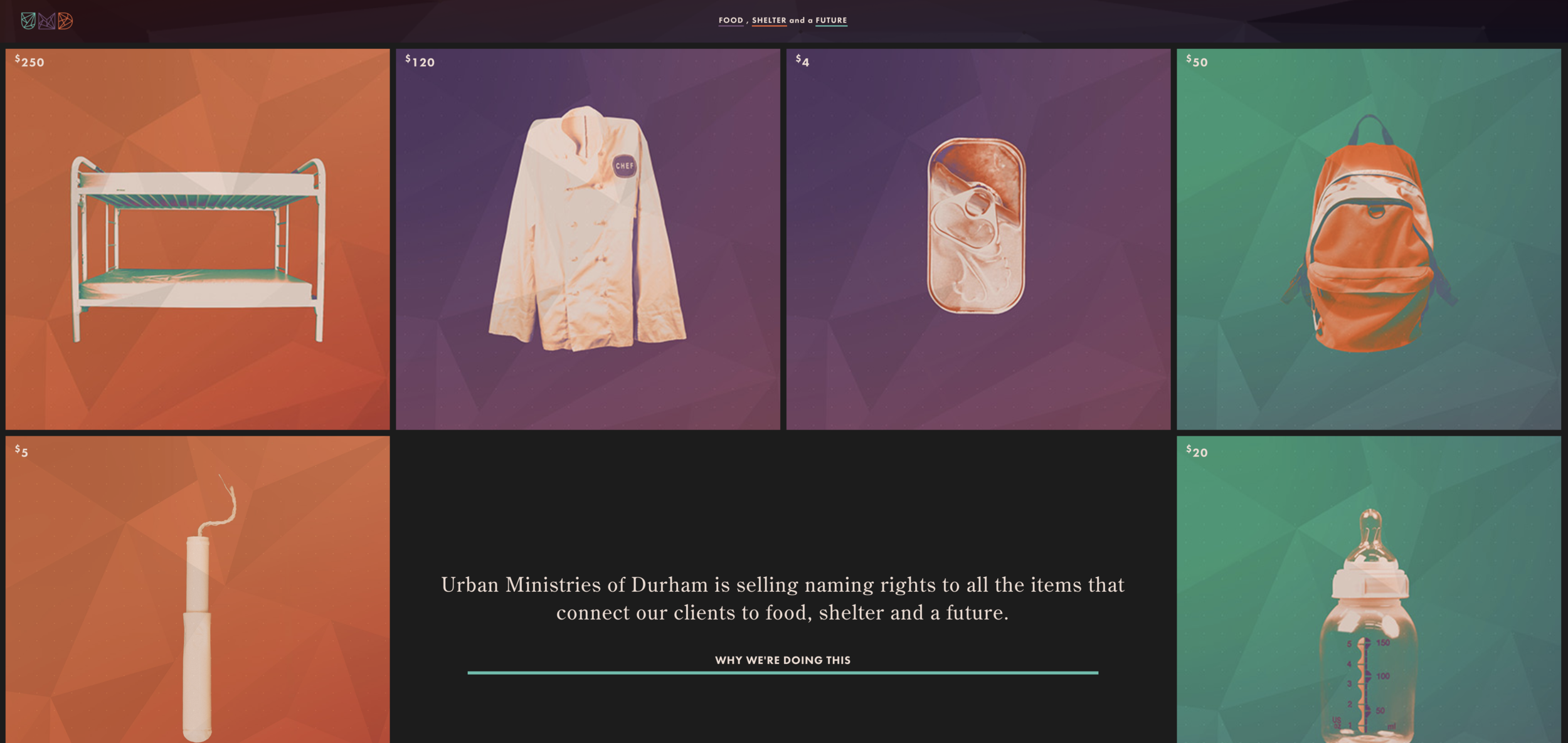
Block images are a great way of making use of all the space on your Squarespace site. They can be extremely useful when showing off a series of items. Each individual block draws you toward a different product, items or service.
I have used this effect throughout my own personal Squarespace portfolio site. I needed to list a large variety of different projects I had worked on ranging from brand design to motion graphics. The image block layout, without padding around the images, offered a clean-cut display of my range of design work.
In some of the blocks I used images, whilst in others, I used animated GIFs. This helped to add to the playful personality of my site and myself as a brand. My personal website can be viewed here at:
To achieve this effect in Squarespace, you may need to start with the previous Squarespace Version. For my site, I used Squarespace 7.0 to achieve this effect, apposed to Squarespace 7.1.
In Squarespace 7.0 you are able to create 'Index Pages’ these pages act as folders and can hold other pages. From here you can create ‘Project Pages’ each one of these project pages will be a page with your whole individual project inside. Having this Index page set as the home page will allow all your project pages to appear as blocks. To allow all the blocks to stay touching together I simply changed the padding of the site to 0. For these images to appear, simply upload an image as a thumbnail in the settings of each page.
Welcome to the world of tomorrow!
These are only a few examples of design trends which can be achieved fairly easily within Squarespace, I look forward to seeing how they expand and develop over time as we enter 2021.
If you have any queries about creating certain styles within Squarespace, get in touch through our live chat tool or via social media. If you want to have a go at achieving them yourself, visit our Squarespace masterclass for all the online video tutorials and tools you need.


