The Website Blueprint.
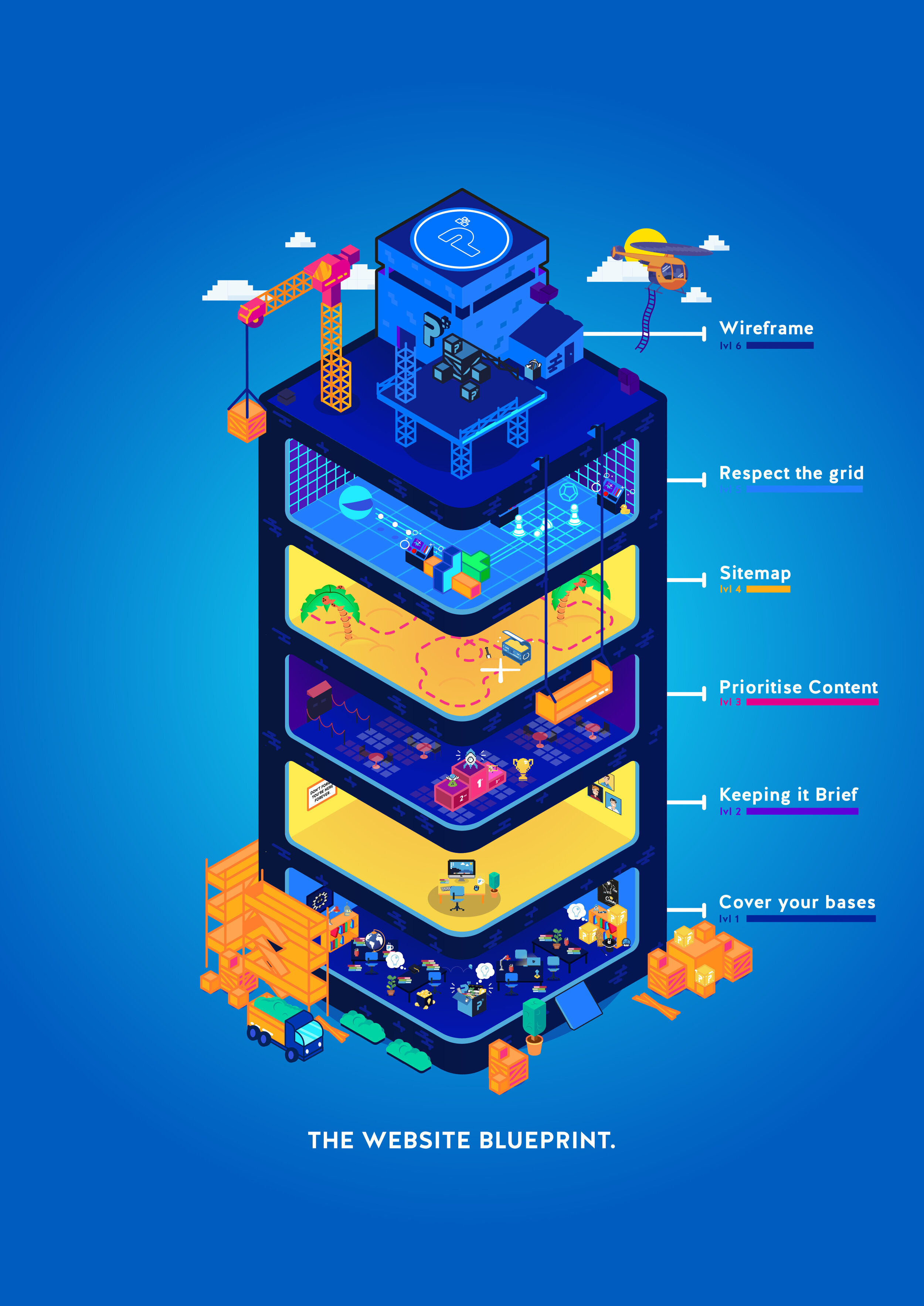
PixelHaze Creative Director Ken Rees shares the Pixelhaze design process for creating a website through an isometric poster design.
The Website blueprint.
Without a concise plan, web design can fall apart quite quickly - much like the structure of a building. You need solid foundations before you start construction on the other stages.
It needs to function before it looks pretty.
That’s why we’ve created this basic structure for creating a website. Through a vibrant flat design poster, we’ve outlined each part of the website design process.
Cover your bases
Before even touching your website you need to know your business inside out. What is your website for?
If you’re proactive with your planning at the inception of your website, you are far less likely to make mistakes whilst developing the site. It is important to do your research beforehand; using a range of design methodologies you can properly understand your target audience and understand what they would best want for your website.
Methodologies can include, Ethnography, Surveys, Interviews to name a few.
Asking yourself the right questions at the beginning of your project can save you so much time down the line, and can prevent you from making mistakes.
Do the groundwork to create the right foundations for your project.
Keeping it Brief
By creating a brief, you’re creating a plan of action for your project. What are the deliverables? How long will the project take? Who is your target audience?
By creating a project brief you are setting out a plan of attack for the entire project. It gives you and everyone involved a clear end for the project goal.
A clear consist brief makes for an understandable laid out project.
Prioritise Content
What does the user need to see first? How will your content be displayed?
By correctly prioritising your content you control what the user sees first.
You don’t want to show the wrong information front and centre as it may deter the user from continuing to view the site.
By displaying the correct content you are making the viewer aware of what your website is, attracting the correct audience and encouraging users to view more of your site.
Sitemap
How will your website flow?
Where will each page take you?
By creating a sitemap, you are creating the skeleton of your website.
You are able to see how your website will function before development; by detailing the correct User Flow, you will enable the best journey through each page on the site.
With a sitemap, you are able to take the user on a path you decide and lead them to a specifc end goal (e.g. getting in contact with you, buying a product).
Respect the grid
Keeping in line with the 12 column grid.
The 12 column grid is used by modern websites to create responsive and uniform layouts; this was first popularised by Twitter.
If you mentally split your web-page into a grid layout, each “row“ should contain elements where their width spans “columns” equal to a factor of 12.
For example, if you have a row with an image that spans 2 columns, the rest of that row’s content (be that a paragraph or another image) should span 10 columns.
One of the main reasons we use Squarespace for web design projects is because of it’s fixed grid system which makes it easy to create adjustable, neat and robust web layouts.
Wireframe
The website layout.
Wireframes are often rough but extremely useful for your website layout.
They are the framework which your website will be built upon.
Rather than creating the website straight away and running into complications with the end result, you can plan out the final layout beforehand and test it.
How does it look? How does it function?
These are all questions that can be answered before even touching a computer.
“failing to prepare is preparing to fail”
- Benjamin Franklin
Having all these variables planned out beforehand will help with the entire web design process.
We use this same process from beginning to end of each project we take on. We often refer to this poster in the office ourselves in the office to ensure we haven’t missed a step.
If you’d like to have this poster reminder in your office, feel free to download it from our store here.


