Squarespace Button Plugins
Our members may well have noticed over the past few months, we've been creating a wider library of buttons that can be used in Squarespace.
This is not necessarily the most exciting topic, but one that can certainly add a visual appeal and a more customized approach to your website design process.
Why do we need plugins?
Squarespace does many things right. The overall look and feel of the template is excellent, and it has a very minimalist, modern and user-friendly approach. There can be a criticism sometimes in terms of Squarespace's management of the balance between different design features and usability. Often they tend to cut back on design features in favour of usability. This can be said for the vast majority of website builders available.
In fact, in the last few months, there's been a criticism almost the other way, in terms of Squarespace of trying to add in more features, which is adding more complexity, so they're constantly walking that tightrope between easy to use, but also making websites look bespoke.
That's where plugins come in. We build a lot of our plugins off the back of custom projects that we work on with clients. So, when a client comes to us for a project, we then add customizations based on what works for their design and then build out from that. We then save some of the features that we have designed and add them to our plugin library, to allow people who are building their own websites to access this code at a heavily reduced rate.
Button Plugins
This week, we're going to focus on buttons. It's clear that there are very few options for button design in Squarespace. The animations are all consistent, the colours and fonts can be changed and we have three different sizes to choose from. We also have the option to change it between rounded corners, pill-shaped or rectangle, but shy of that, there isn't really much else we can do. Yet with modern CSS, we can do so much more, whether that's animations on rollovers, using shadow effects or using icons within buttons.
We've been working hard behind the scenes to develop a toolkit, to allow designers to tap into these features and add them in, in an as easy as a 1, 2, 3 step process.
Examples of PixelHaze Button Plugins
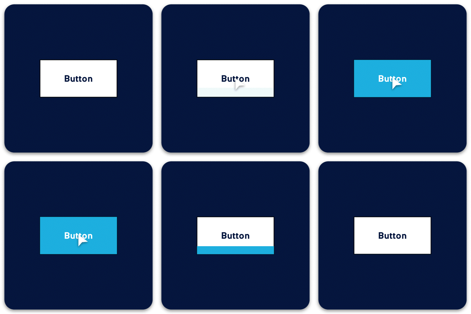
To start off with, we've got the PixelHaze Pint button. So as you roll over the button, it switches from one colour to a secondary colour as if there's some beer being filled up in a pint glass. So that just adds a little playful element to it. It works really well and it's very popular with some of our pub, restaurant and hotel websites that we've created in the past.
Another example is our Exit Sign button. The shape of the button, the position of the arrow, and the border on this button style cannot be done directly in Squarespace without custom code. The button reflects an emergency exit sign, however, the colours, the font, and even the icon can be changed to a range of options from the library. This adds a considerable amount of customization. We've also added an optional drop shadow effect, allowing you to lift the button from a page if it's a key call to action. This is one of our personal favourites for certain key events and making sure that the button really stands out.
The ‘PixelHaze Pint’ Button
The ‘Exit Sign’ Button
We have a number of other effects, such as Pulsing Buttons. With a pulsing button, as you roll over the button, it creates a pulse - a semi-transformed box that comes out from the button itself. We've got other variations as well, where we can adapt a text link in Squarespace into a full button effect. So those who are comfortable in hand-coding would be able to do this. But for everyone else, this gives them the opportunity to add a lot more customization and put buttons in quite interesting places on their websites.
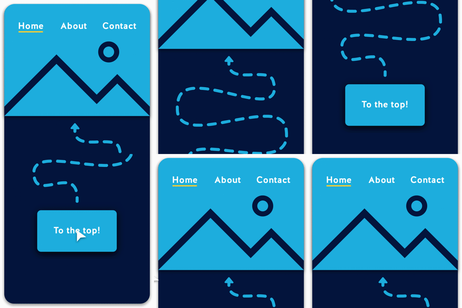
The last example of a useful button in our PixelHaze library is the 'To The Top' button. As we scroll down to the bottom of the page, there isn't a feature in Squarespace that allows you to take you straight back up to the top of the page. It's not needed in every scenario, but where you have a lot of content on a page, having a 'to the top’ button can make a big difference.
The ‘Pulsing Button’
The ‘To The Top’ Button
These are just some of the many PixelHaze Button Plugins that we have available. We'll cover navigation menus and shortcut menus in a future article, but if you need to get up and running and start adding more customization to your website, without adding a huge amount of code, then we strongly recommend checking out our button selection on the PixelHaze store. You can access them here.


