O Canada, why didn't you deploy the red team?
Elwyn discusses the importance of ‘The Red Team’ in web design and branding, and why the Canadian Army rebrand will go down in history as what not to do.
So, the new Canadian military rebrand has caused quite a stir on the internet over the past week or so.
If you haven't had a chance to look at it, here's the new, let's say, Minecraft-inspired logo design. From what I gather, this was proudly announced and posted on social media as the updated branding and profile pic, then quickly lowered in rank with a new (updated) message, watering down its significance.
But the damage was already inflicted.
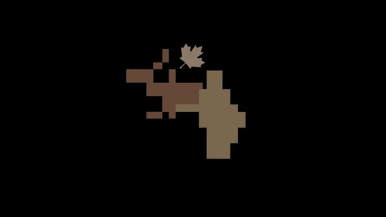
You cannot say with a straight face that the Canadian Army rebrand is boring. Is that a Moose in distress?

Why oh why is the maple leaf ‘falling’?!
This added to the confusion and created thousands of new internet trolls in one broad stroke. Either it was a new message, or the original message hadn't been clarified correctly. If we give them the benefit of the doubt, it was stated that this new brand was a way of complementing and energising the existing brand, which would remain the main brand. Are you with me?
This debacle points to a glaring absence: a "red team."
- Elwyn Davies
This whole sorry episode is based on a few assumptions that went wrong, and this happens repeatedly when you don't do your due diligence in-house.
Let’s crack open the black box and examine what went wrong and what a better approach might have been.
The Missing "Red Team"
For my two pennies worth, this wasn't just about the aesthetic of the new logo but also the decision-making process. The logo seemed bold, perhaps even creative to some, but fundamentally, it was misunderstood.
What was it even meant to represent? This misstep underscores a scenario where a group, buoyed by unanimous agreement, pushed forward an idea without considering potential fallout. Not everyone will appreciate a new concept—this is the internet, after all—but the expectation was that most would view it as a fresh, modern take, tying neatly into military themes. Unfortunately, reality paints a different bloody picture.
When I learned about this concept roughly 15 years ago, I instantly integrated the red team into my design process. Once a project reaches an agreed-upon stage or milestone, we invite the red team to do their worst. They are encouraged to pick any holes they can find so we can either repair the breach or prepare to defend our design choices.
Knowing potential pitfalls strengthens the project and often impresses clients with our thoroughness. Design is not a binary process; it’s rife with decisions and trade-offs, making it crucial to identify possible issues well before client meetings and public launches. After all, ‘the internet’ will not hesitate to play the role of the red team with zeal, so it's best to address potential criticisms during the development phase.
We sometimes extend this to include friends and family, inviting them to critique and dismantle our designs. Although it might seem harsh, turning the critique into a game—where participants are encouraged to find flaws—can be quite enlightening and, surprisingly, fun. It ensures our designs are robust, well-vetted, and ready for the public eye.
The Camel: A Horse Designed by Committee
The pitfalls of collaborative design efforts, where too many inputs can lead to a lack of clear direction, are vividly illustrated by the term "design by committee."
This often results in what's colloquially known as a "camel" — a product that, while intended to be a horse, ends up being an awkward compilation of everyone's different ideas. In the case of the Canadian military's logo redesign, it's possible that the involvement of too many stakeholders led to a design that didn't meet any clear objectives and confused the very people it was supposed to represent.
This brings us to the camel in the room — if you squint a little, it even looks like a camel, crossed with a Moose that was crossed with a kangaroo. It's a hodgepodge of different ideas, none of which clearly dominate or cohesively blend. When each team member adds their input without a clear unified vision, you end up with a product that may satisfy the internal checkboxes but fails to resonate externally.
“If you squint a little, it even looks like a camel, crossed with a Moose that was crossed with a kangaroo”
- Elwyn Davies
In design, especially in a high-profile case like this, it's essential to balance collaborative input and a clear, singular vision. The risk of this project being a camel highlights a significant challenge in design processes: too many voices can dilute the strength and clarity of the final product.
We often implement two types of brand projects:
One follows the KISS philosophy—Keep It Simple, Stupid—focusing on simplicity and clarity.
The other takes a more adventurous route, exploring innovative and bold ideas. Regardless of the approach, we engage our red team early to find potential flaws. This prepares us to answer client queries effectively ("I thought you might say that, that’s why we’ve done X, Y, and Z") and ensures we deliver a well-considered and robust design.
Finally, before we sign off, one more point about the rebranded logo that caught my eye—the maple leaf. It's at an angle as if lifelessly falling to the ground. Why not add a white flag while you are at it?
This image is surely the opposite of what you want for a bold, potent, independent military symbol. Sometimes, the small details can have the most significant impact on the overall perception of a design.
In my book, that swiftly moves the project from a SNAFU to an all-out FUBAR!
Book a 1-2-1 with me
if you're looking for a personalized review or a red team perspective for your project, I offer one-to-one sessions that can serve this very purpose. You can book a session with me to ensure your design is battle-hardened and ready for public consumption.