Adding Personality to your Website with Animated Gifs
PixelHaze Academy member Ken Rees shares his experience in motion graphics and how animated gifs can be used throughout a website to add personality to your brand.
Icons are often used within websites to help navigate the user with simplistic designs intended to explain the meaning of sections in a minimal way. Used correctly, icons can be a create addition to a site.
Although icons are a create way to break up your content, they can be improved upon further to add an extra layer of depth to your site. Eye candy used to engage your viewer. Depending on the websites branding, using animation in the right way can be a welcome addition to your website. For instance, for an exciting child-friendly website you may consider using more energetic, vibrant animations. Whilst with a more boutique, modern site you’d use more simplistic subtle animation to suit the tone of voice.
There are two main ways in which animation can be implemented into your site depending on the complexity. Custom Cascading Style Sheets (CSS) or creating the animation manually through programmes such as Adobe After Effects. CSS is mainly used for simple animation for example if you wanted a gear to rotate slowly. Whilst manual animation made in After Effects would be used for a logo animation with multiple moving parts. Recently I’ve used After Effects to create a moving visual which explained a client’s philosophy.
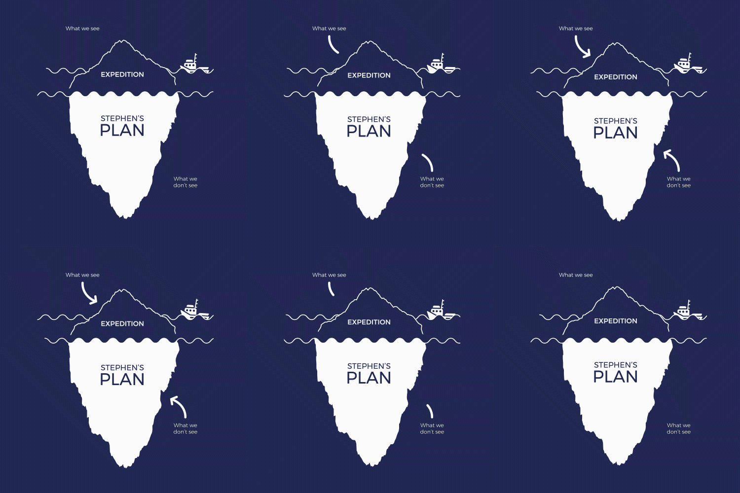
I first created the moving parts within adobe illustrator using a flat design art style. Porting all the moving parts to After Effects I was able to animate all the individual moving parts. Although the illustration of the Iceberg analogy would work as a still image, using animated GIFS adds far more personality. For this GIF I opted for soft, clean cut movement which fit the message I was giving, the style and matched the branding. Logo Animation Animated gifs can also make a welcome addition to Logos, giving depth your brand. I have used GIFS in simplistic ways on repeat to ensure it they don’t distract from the website. In the recent ‘Stephen jones’ logo and created and developed, I incorporated a subtle rotating compass which slightly turns left and right constantly.
When creating GIF it’s important to make them short in duration so the file size is far smaller and loads instantly on a website. It’s also key that your GIF starts as it finishes. The starting frame needs to be the same as the ending frame so the GIF stays in a continuous loop. This will ensure the animation doesn’t look glitched or unfinished keeping it seamless no-matter where it is on the site. The only issue with gifs is that they will be in a continuous loop, in some instances you may want to have the gif only play through once.
Fortunately, we developed code which allowed a selected animated GIF to play through once. When the animation has been complete the code will then replace the GIF with a still image to create the illusion that the gif has played through once. This can work really well at the begin of a website as an introduction on the home page.
For my details about our custom plugins for view them here on our Plugins section. Creating custom animated gifs from scratch can prove difficult if you have not had experience in the software mentioned I this article. If you have a need for animated GIFs in your website feel free to email me at: ken@pixelhaze.co.uk to add personality to your brand.
- Kenneth Rees


