Wild beast of the mountain - Logo hidden stories
In this first chapter of our Logo: hidden stories series, Elwyn explores the hidden message and history of the Swiss confectionery product, Toblerone.
As part of our branding-focused Bootcamp Volume One, we explore some well known and international brands that have hidden meanings. One of my favourite examples for this exercise is the logo by Swiss chocolatiers, Toblerone.
I realise now that this is probably not the best example to kick off with, I am hungry once again. Curse my sweet tooth.
From a designer’s perspective, impactful logos and brands need to achieve multiple goals, and although these objectives may change from company to company, there is often a theme that we follow when entering the world of brand design. We need to ensure our brands pack a punch when it comes to standing out of the crowd. We need to accentuate the core values of the organisation. We need to ensure the logo resonates with the customers of our clients. These are just the essentials. If and when we get to the point where we achieve all of these objectives, we can sometimes look to hide additional meaning to our logo designs.
I have probably made this all sound far easier than it actually is, in fact, many of the examples that we will be showcasing in this series will be a pinnacle of a brand designer’s career. We may not reach this particular summit, but I often find that when training the next generation of designers, we should look to the examples that have inspired us the most.
Is there a hidden message?
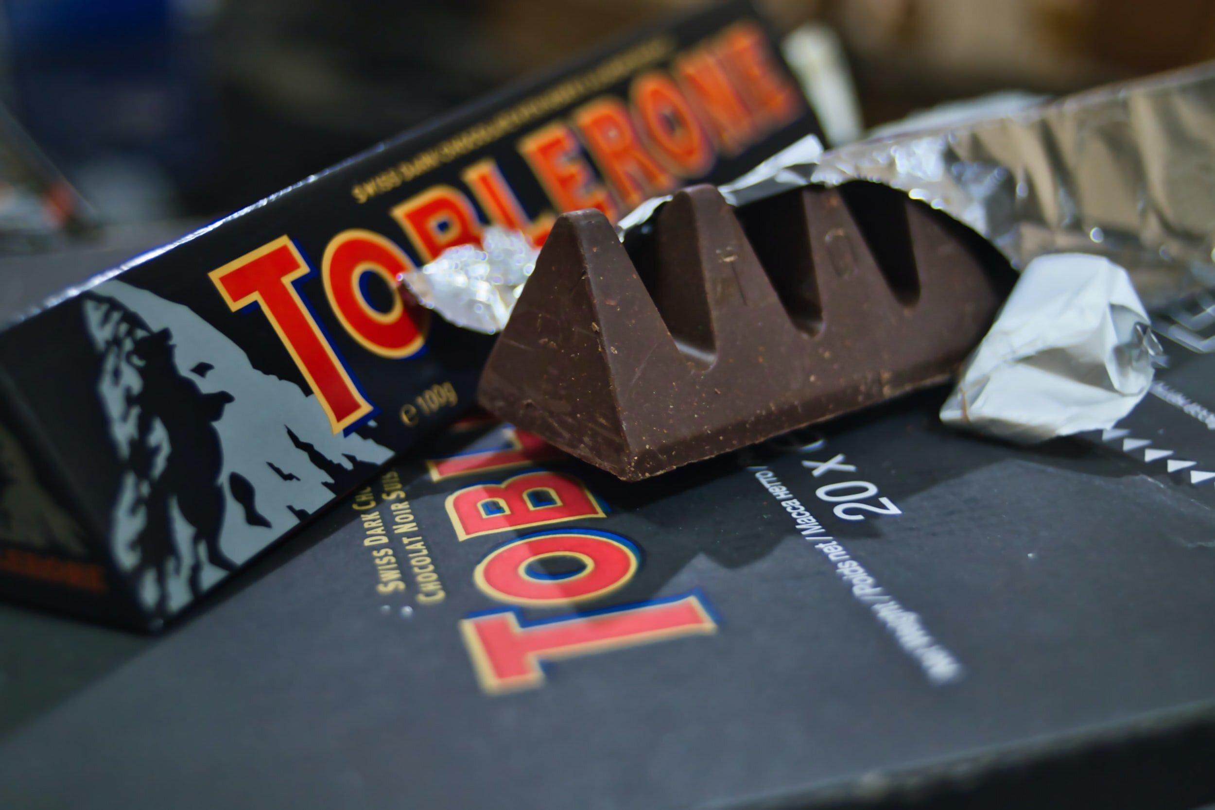
Look a little closer and you can see the bear silhouette within the Matterhorn, an Alpine mountain dividing Switzerland and Italy.
For sure, look a little closer and you will find there is a silhouette of a bear on its hind legs within the mountain. At this point, you are either nodding your head in a smug superior manner - ‘of course there is a bear in the mountain, everyone knows that.’ Well, I can be pretty confident that at some stage in your life, you didn’t know that fact, so go ahead and wipe that smug grin off your face.
For the rest of us, we have that ‘aha’ moment when we finally see it. This is the crux of this series of blog posts, and why we include this light-hearted exercise as part of our blueprint course within our Branding Bootcamp.
Why a bear? And why a mountain when it comes to that?
The Bern Coat of Arms
We could leave it at that, however, after a little extra digging, I have come to realise that there are a number of cultural reasons for this particular combination. Created by Emil Baumann and his cousin Theodor Tobler in 1908, Toblerone was a product of Switzerland and in particular, the city of Bern. Interestingly, Bern has a black bear on a red and yellow shield for it’s coat of arms.
If you look at the triangular packaging of Toblerone bars, in addition to seeing the bear, you will also find that the colour from the Coat of Arms has been lovingly carried over to the brand.
As for the mountain itself, you will find that it is a digital representation of the Matterhorn, a triangular-shaped mountain that sits on the border between Switzerland and Italy. In addition to the Mountain peak being displayed on the packaging, it is widely accepted that the shape of the Toblerone chunks also pays homage to this.
“We have that ‘aha’ moment when we finally see it. This is the crux of this series of blog posts, and why we include this light-hearted exercise as part of our blueprint course within our Branding Bootcamp.”
Toblerone consumption tip!
If your mind hasn’t been suitably blown by the above reveal, you will be aghast to find out that you have probably been breaking off your Toblerone triangles all wrong. Next time, instead of breaking off the triangle away from the bar like a Luddite (alas I used to be one - so uncivilized), try pushing the tip of the triangle towards the remainder of the bar. You are welcome. Just remember PixelHaze Academy as your social status blasts into the stratosphere of the back of this newly discovered knowledge.
Branding & Bootcamps
If you live in Wales and would like to learn a series of tips and tricks about branding, why not apply to join one of our Bootcamps. PixelHaze Academy Bootcamp: Volume One is designed to fast-track creatives who would like to learn all key aspects of logo and brand design. Here our designers are forged in a light-hearted, competitive environment by teaming up with a partner and going toe-to-toe with two other teams. If this sounds interesting, get in touch to see if you are eligible.
Alternatively, if you are involved with a company or organisation seeking a rebrand, why not give some consideration to our efficient and creative branding workshops, held at our Mid Wales design studio or online.


