Combining Canva with Squarespace - Part Five
Welcome to the fifth chapter in our Combining Canva with Squarespace free course. In this tutorial chapter, we're going to learn about the duotone effect for images in Canva.
We've covered a lot so far, so if you've missed any of the previous chapters, check out the PixelHaze YouTube channel or the PixelHaze Academy blog.
What is the duotone effect?
The duotone effect is an image editing effect where we use two tones of the same color within a photo. You can achieve this effect in Squarespace's image editor, where you change the saturation right down to a black and white photo and then you can use multiple filters. There are a couple of blue tones that you can convert those banner images to have a black and white image with the blue tone overlaying on top of it. This method is a bit long-winded and the way we're going to achieve the effect is far, far better. Since this is a Canva course with application to Squarespace, we thought it'd be a great opportunity to demonstrate Canva's utility in this scenario.
Setting up
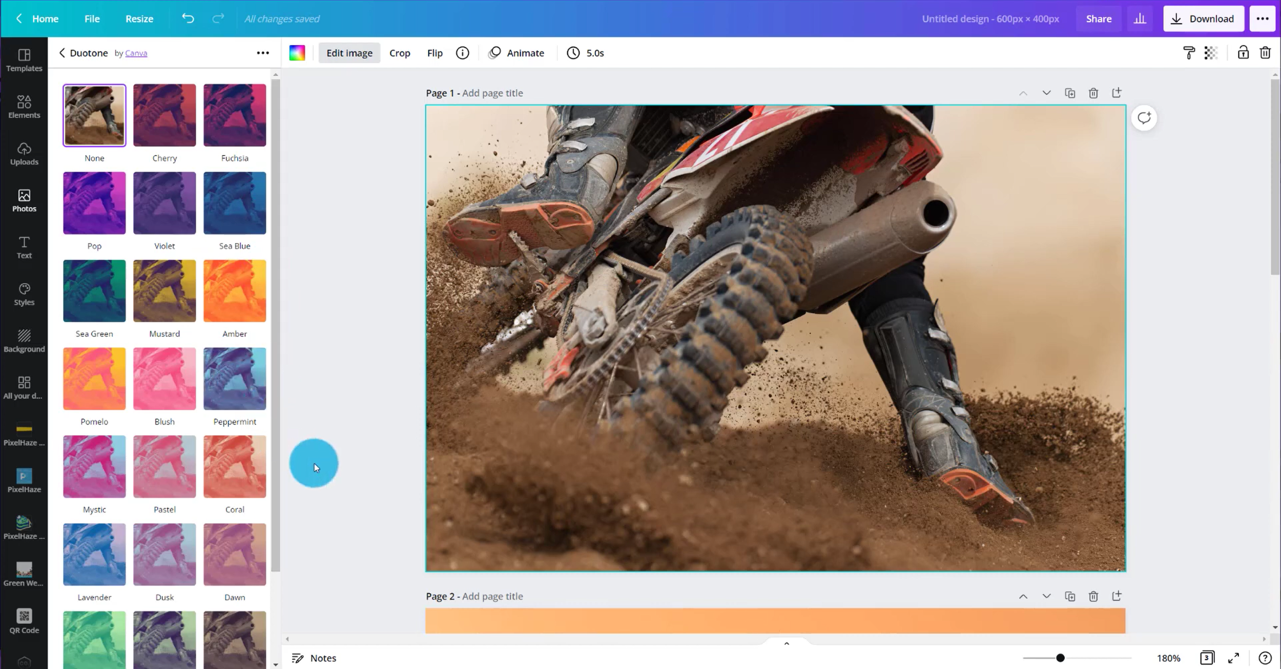
Head over to Canva and create a new graphic by selecting custom size and then selecting a width and height that works with a 3:2 ratio. In this example, we're going to use 600 x 400 pixels. If you're going to need larger images, you can just scale up the size, locking in the ratio. We might normally use 300 x 200 pixels for a design, but this will be too small in this case.
We're aiming to create three panels of images across our Squarespace page so we're going to be repeating this effect on multiple images. Going with 600 x 400 is a nice size to fit across without any pixelation or distortion on the image or the other way around having an image that's so large that even though Squarespace's own resizing and compression tools it still might be loading an image size that's larger than it needs to be. This is where we need to try and find the balance between those two so a bit of trial and error may be needed.
We're heading back to our motocross theme for this tutorial. Head to the photos section of Canva and search Canva's image library for motocross images. This time we're aiming to find a few different examples. Find a suitable image and then click and drag the image to resize it so it fills the design area. Add a new page and find a new image. Below are the examples we used in this tutorial.


In this example, we're deliberately picking images that are quite different. Some different styles to choose from might include close-up images, images where the subject is further away, silhouette style images, and so on. The reason we're going for such contrasting images is to demonstrate how this can evolve once we've added in our duotone effect. Once we have three images, we're ready for the next step.
Applying the duotone effect
Click on the first image and select 'edit image'. Here you will see the series of stylistic options, one of which being the duotone effect. Then we can start trying out different duotones, for example, peppermint. It's really that simple, we pick an effect and apply it.
Remembering what we did in chapter three of this course, we used the motocross theme to create splatter frames and applied these to our trial Squarespace website. Since the duotone images we're creating here are going to be applied to this website, we should make our duotone colors complement the colors already on our site. For example, we have quite a few oranges and reds on our site to really bring out that 'danger' element of motocross so we might choose our duotone effects to complement this.
Duotone color options
In order to change the colors of our duotone effect, once we have applied it, click on the color next to highlights or shadows and select a suitable color. When creating a duotone effect, we need one light color. We can see with Canva's default color swatches that instantly changing the highlight color to a red/pink has a big impact, especially with the color of the shadows as black to create that contrast. This image gives us a very different look and feel from the original image.
This is such a quick and handy effect to create different styles. If you like, you can create this effect on multiple images in bulk and then upload them all at the same time to Squarespace.
Tweaking the colors in the duotone effect
When creating this effect, we can tweak the colors to whatever shade suits us. In our example, we're going for a more orange-red color by manually dragging the circle around in the color choice section. If we are going to manually change the colors we need to remember the colors that we've chosen using the hexadecimal code (copy and paste it somewhere) so that we can apply the exact same color to our other images when adding the duotone effect.

Changing the duotone colors manually. Copy the hexadecimal code to the clipboard to use the exact same color for the other images
Now we can apply the duotone effect to the other images we selected previously, remembering to paste the hexadecimal value for the color we chose for our highlight color in the first image. It doesn't matter which duotone option we select if we are changing the colors manually. In our example, we had the highlight color as our hexadecimal red-orange and the shadows as black. Apply these settings to all of the images so that we have a consistent theme through all of the photos. Now we should have three duotone images ready to download and put into our site.
Next up, download the images individually. We are going to download them as JPGs because there is so much detail in the images. Even though we have a limited number of colors, there are different gradients or versions of that tone so therefore this is enough to choose the JPG file format over a PNG file. When downloading multiple images, we usually use the rule of three. If it's three images or less, it's generally quicker to download them as individual images but if it's four or more, it's quicker to download them all as a zip file and then extract the images later on.
Uploading to Squarespace
Now we can jump back over to Squarespace, click edit, and add a new section. We're going to add a blank section that will allow us to build our images into the panel. We can look at the color options by clicking the edit button and the 'colors' tab. We've chosen grey here for our website. We're next going to reduce the section height to small.
We want to add our images in three columns across this panel. To do this we will click the plus button and insert three horizontal lines. Then click and drag these lines so they are side by side which creates the columns. Underneath each line, click the plus button again to add in an image block. Then upload each image from where we saved it on the computer.

Adding a new blank section to Squarespace

Adding scaffolding lines to the new section to guide the image placement
Because we saved these images with a 6 x 4 ratio, the images are the correct size and we don't need to do any cropping or editing on Squarespace. In our example, the screen size we're using meant that our images were slightly fuzzy, so to change this, we could go back to Canva and resize the image to a larger one, maintaining the 3:2 ratio. Now that the images are in place, they're going to hold their structure and width on the 12 column grid, so we can remove the guide-lines.
We could then put a title in for each image, either by clicking on the image and adding a caption underneath or by clicking the plus button and adding a text block below in that same column. An example of a title for each could be three different services that the company provides. We can alter the text size by using the pre-sized 'heading 3' option, for example.
We can play with the settings of the content width and height to help ensure we don't lose any quality on our images - in our case, changing the content width to medium really helped.
To tidy up our new section, we will look at changing the background of the panel, either by changing the color settings as we did earlier or by adding an image to the background. We could add an image and choose a free stock photo from Squarespace's library of images.
We selected a mud splatter type image and then increased the overlay opacity so that we can get the texture of the mud splatter coming through without it taking away from our duotone images themselves. We can also edit the image within Squarespace to crop out sections of the image we don't want, and change photo settings such as contrast, saturation, highlights, shadows, and so on to get the effect we desire. This is a trial and error process.
Ensure that you save your changes by clicking the save button in the top left corner.

Viewing the finished product
So there we have our finished product! We can see there is a really nice banding effect that divides the area between the hero unit, images, text areas, and so on. With the effects we created, our horizontal splatter framed image blends seamlessly with the text area below, so when planning content we need to make sure we pair up complementary types of content.
This tutorial aimed to demonstrate how we can use duotone effects to get a consistent style through the website. We have created a stark effect in our example using a strong red and black but you can really play around with the settings of duotone and image editing to create your own unique style.
Thanks for learning with us, and enjoy playing around with this new effect!
This post contains affiliate links. When you click on an affiliate link and make a purchase, we may earn a commission.